Ibedrola Distribución
Customer private area
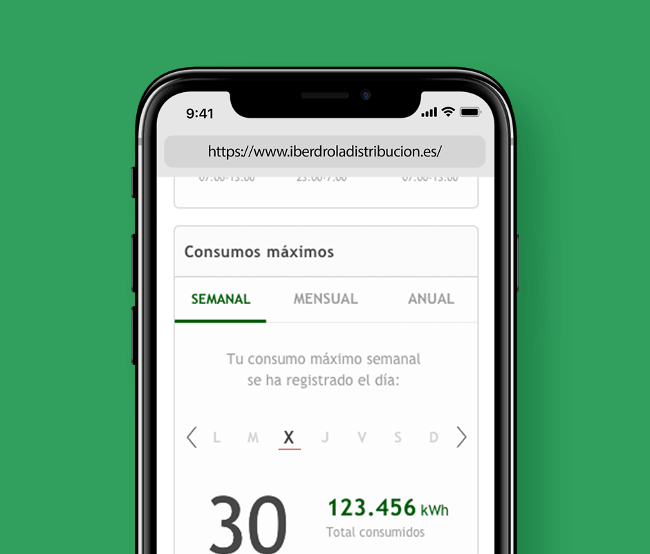
Date: April 2018 | Skills: UX Research / UI Design
Iberdrola Distribución wanted to redesign the customer private area of its website. Most of its users preferred to use the telephone customer service when they had an incidence instead of registering on the site and solving their problems through this tool.
In addition, the consumer area of the site lacked a home screen that allowed users to easily visualize data like their power consumption or the electrical power used.
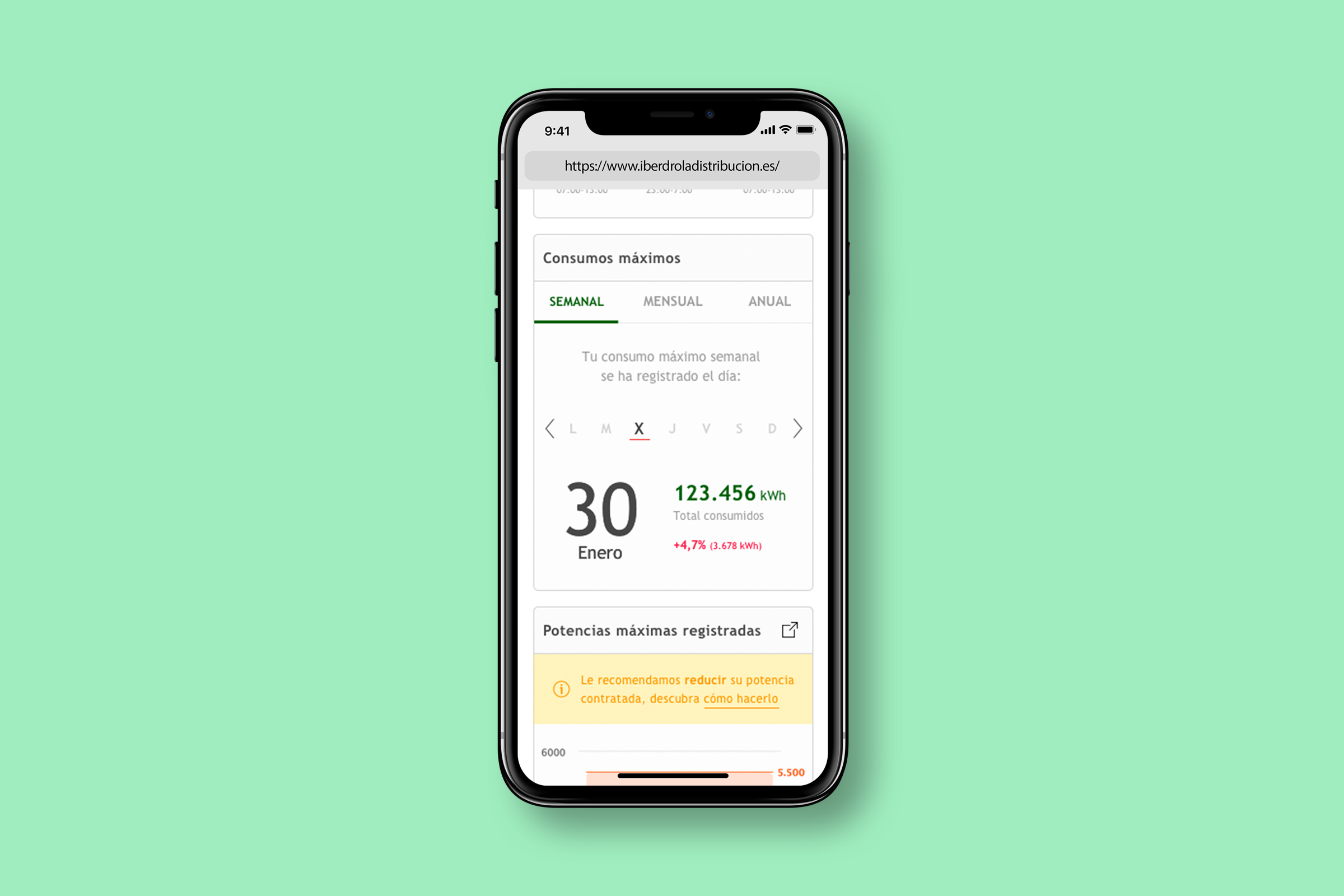
My Role
After the Tribal research team carried out user tests of both the web and the app with the two main user archetypes (private users and estate administrators), my role was to collect the detected usability incidents and, along with my own experience as a UX designer, write an expert review. The goal of this audit was that developers could quickly solve the most outstanding incidents while the full redesign was in progress.
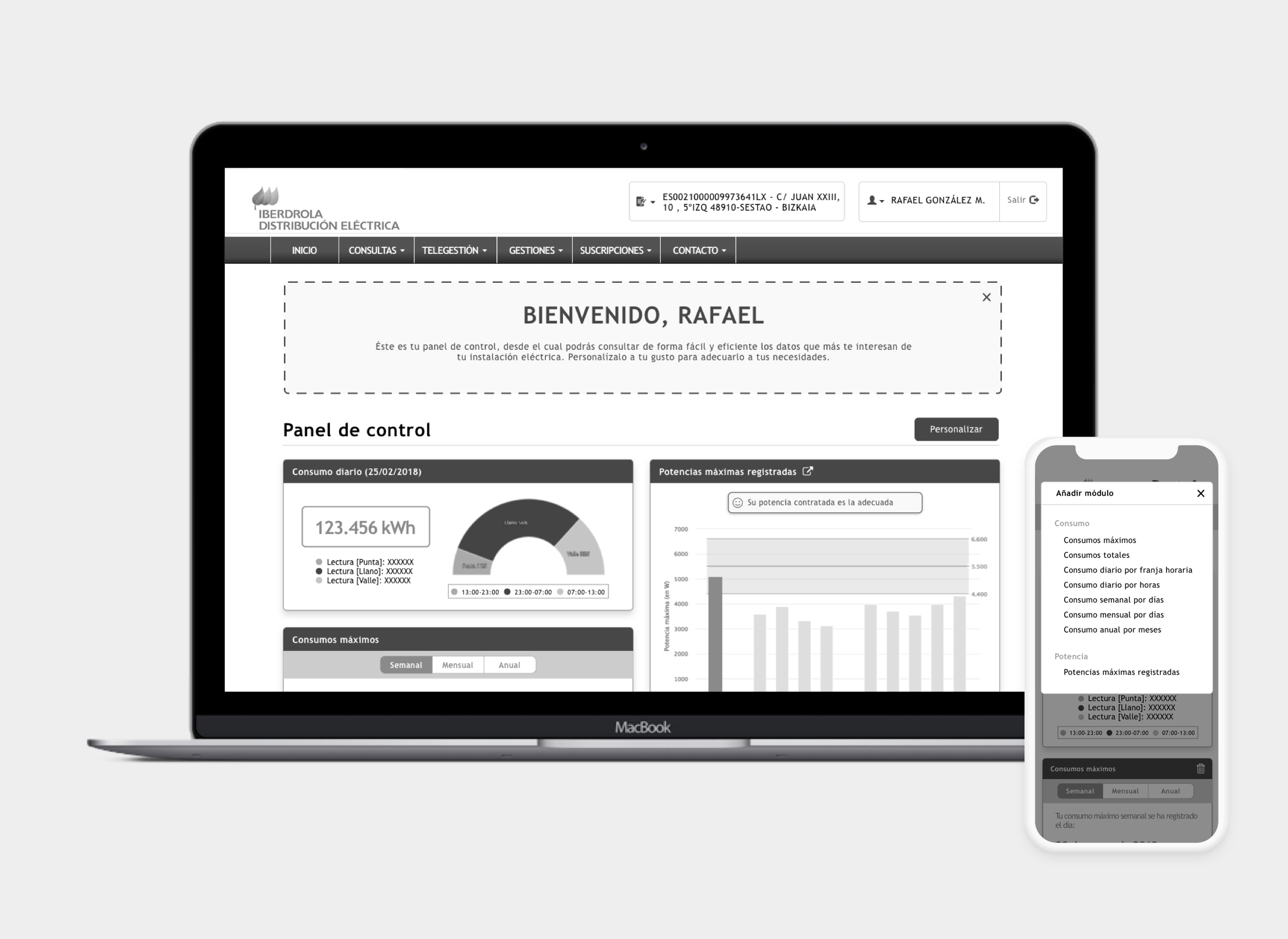
Additionally, based on the data provided by Iberdrola Distribución I had to wireframe a customizable Dashboard screen for the user to inspect information on their energy consumption.
Expert Review
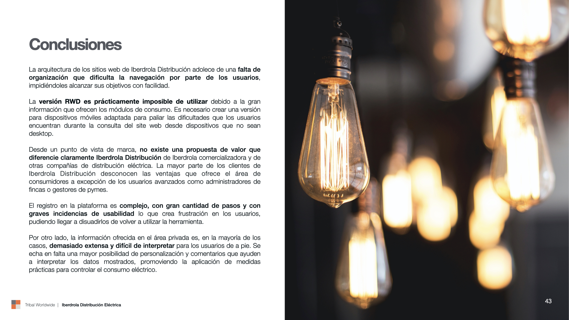
During the user tests, we noticed that the registration process was a severe problem for the users due to its use of multiple verifications (telephone and email) along with serious usability problems in the introduction of the user's data (no warnings about following verifications, lack of explanation about the login password...).
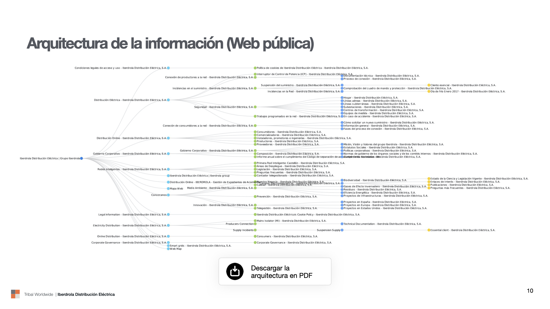
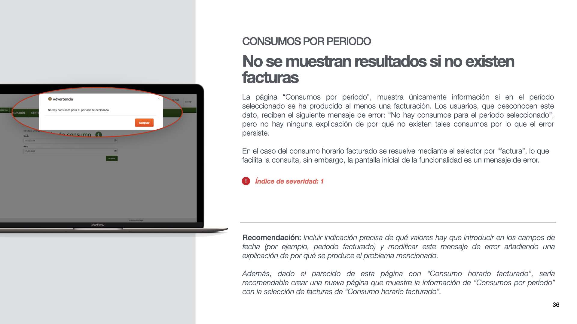
After watching in detail the recordings of the user tests, I picked up the most important incidents along with those detected through deep analysis of the website. I included both in a document assessing the severity of these incidents on a scale of 1 to 5 (from less to more important) and suggesting recommendations for its quick solution.
Dashboard Conceptualization
Using the existing modules in the different customer area pages along with others proposed by the Iberdrola Distribución team, I designed wireframes for the new home screen of the private area. For this purpose, I used Sketch and InVision (through the Craft plugin).
One of the main difficulties that occurred when designing the wireframes was that the modules could create gaps between them when placed by the user since they had different widths and heights. To solve this issue, I designed special modules with energy saving tips and video tutorials that automatically filled in the gaps created when saving the configuration.
Another of the incidents detected when making the wireframes was their adaptation to the mobile version. After trying different configurations and testing with users, we finally decided to keep all the modules in a single column with horizontal scroll and a floating button to add new modules in the edit mode.
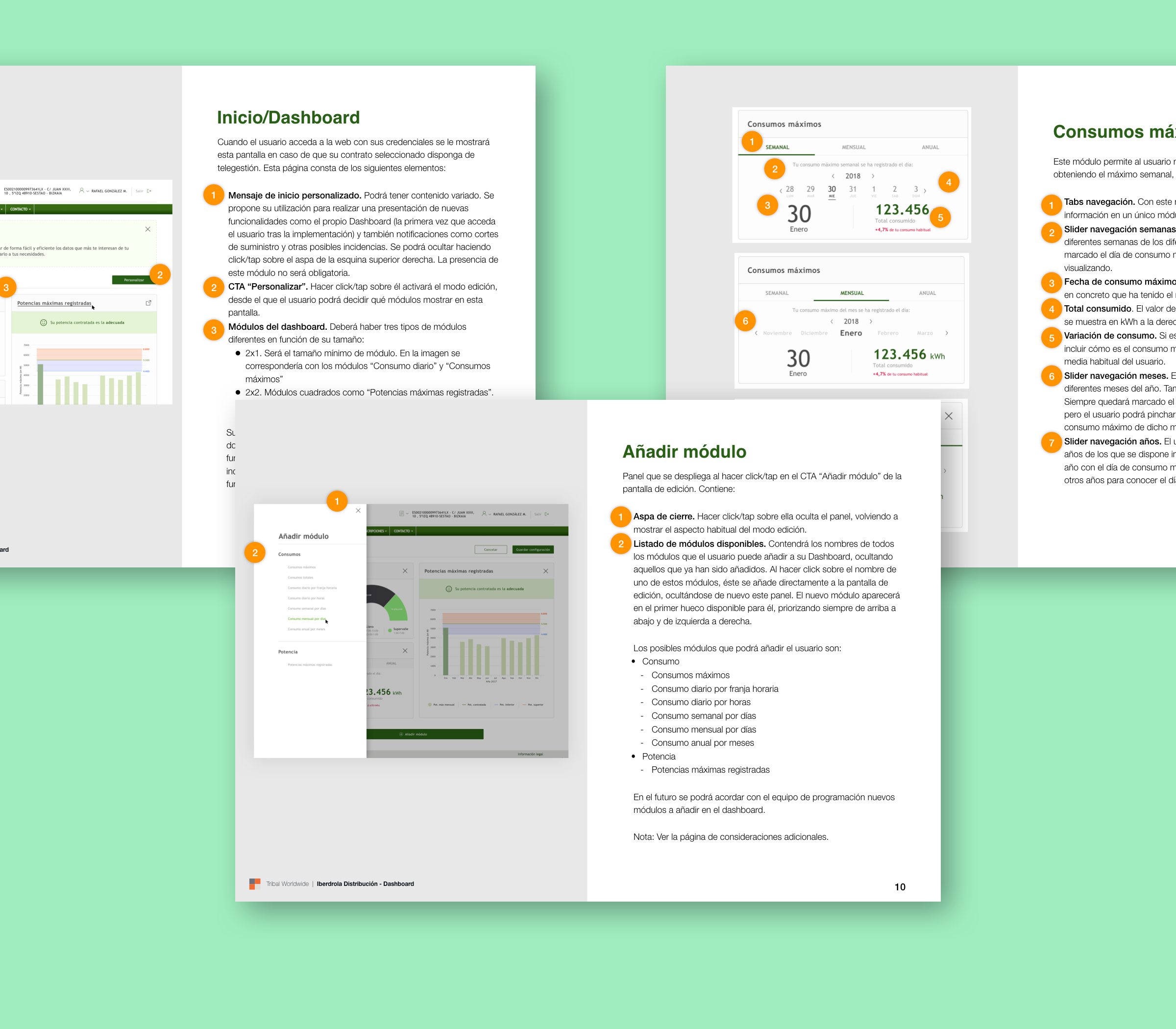
Finally, to help the Iberdrola Distribución development team, I wrote a functional specifications document describing in detail the features of the Dashboard.
Thank you!
Here's more for you to read
Orange Bank - Optimizing the experienceProduct Design
Orange Bank - Redesigning Clementina DSLDesign System
Merck - Con la EMUX Design
Get in touch
© 2026 | Rafael González · Senior Product Designer
