Orange Bank
Redesigning Clementina
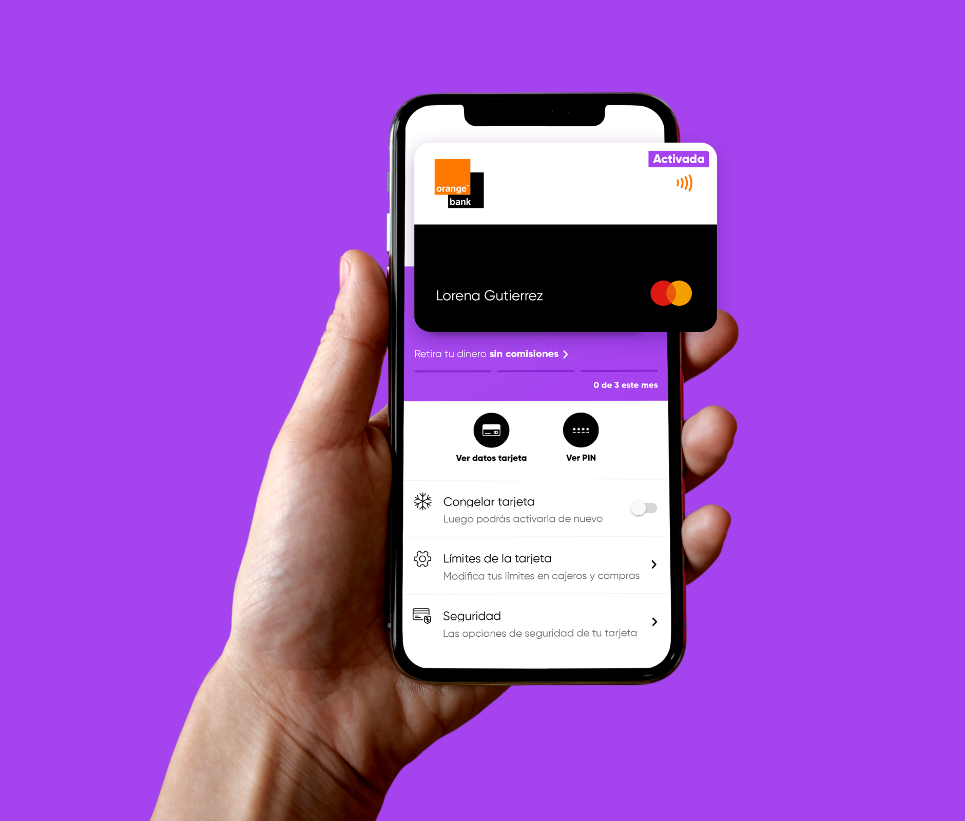
Rethinking the Design System Language (DSL) of Orange Bank
At the beginning of 2018, the design team at Orange Bank conceived Clementina while they designed the mobile app from scratch at the same time. In 2020, after two years of maintaining Clementina and creating new components, several problems appeared that made the team spend time in visual design rather than focusing on the overall experience. Those issues were:
- The component library architecture was not intuitive. It was based on the concept of Atomic Design by Brad Frost (Atoms, Molecules, Organisms), and, most of the time, designers only navigated within the organisms folder since the frequently used components belonged there.
- Not every component was part of the library. There were specific ones within the files of each squad and, therefore, were rarely used outside of them. This issue translated to time wasted in creating and reviewing components that already had an equivalent.
- Duplicate components. Working with local files caused designers working on different teams to create distinct solutions for a common need.
- Time spent on design operations. The app had grown big, and so had our files. Sketch was slow opening them, and Abstract prevented the entire team from working for half-day to synchronize our files and libraries.
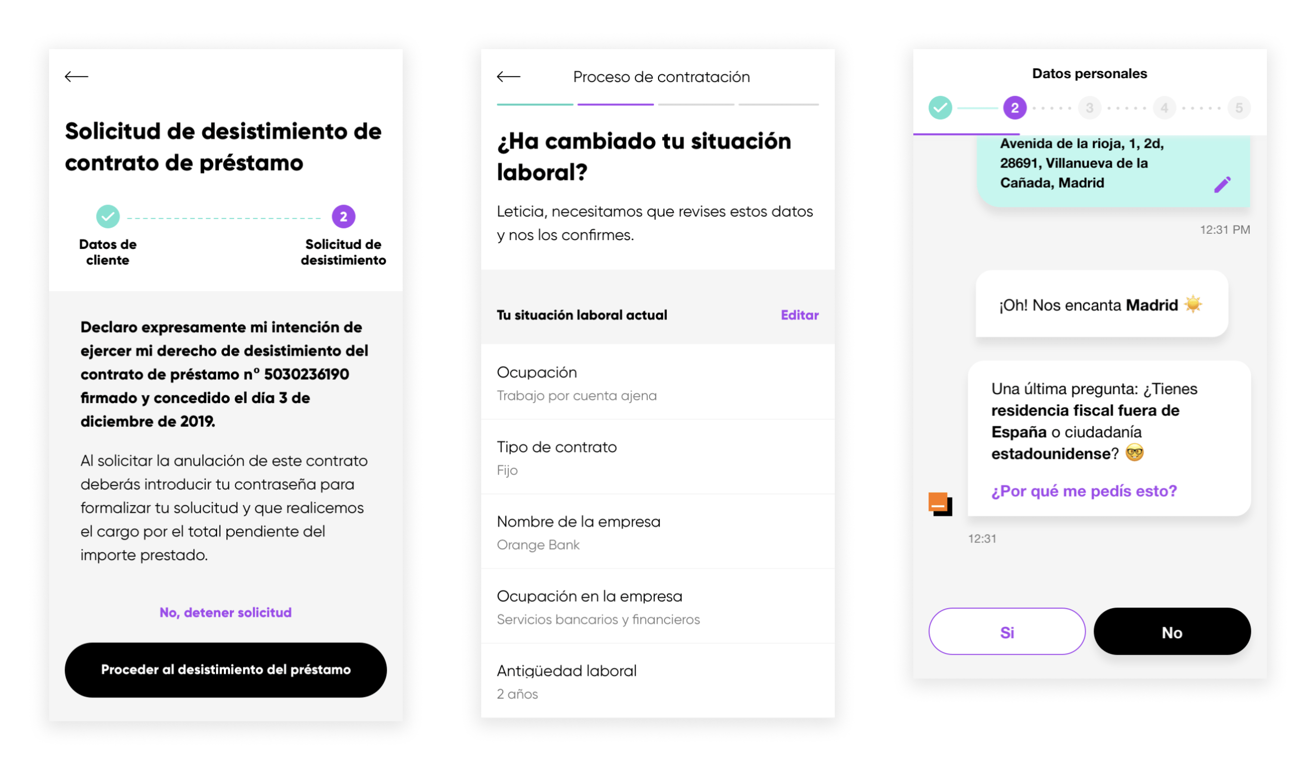
Three different components with the same purpose: showing progress in a task
The challenge
Redesign Clementina in 4 months to solve those problems, making it easier for designers to prototype and design new functionalities. Migrate our design system to Figma to reduce dependencies with external software and plugins, and save money.
My role
Redesign the design system with the help and supervision of the now-former Visual Design Lead Irene Molina.
I focused on migrating all app components to Figma, rearranging them in a new architecture, creating the missing ones, and unifying the similar. I also provided support to both design and development teams for the transition from Sketch.
After redesigning the app library, I continued the project on the back burner, creating the email and onboarding libraries while leading the design of the loans squad at the same time.
The design and development teams started working with Figma and the new version of Clementina in April 2021.
Colors for the present and future
As we wanted the design system to support dark mode in the future, we started researching how to do that with Figma. We found a plugin that automatically switches between two or more libraries, updating the color palette accordingly.
However, the old version of the design system had every color used by Orange Bank with its actual name. For example, the color white (#FFFFFF) was just called “White”. As we started thinking about rebuilding the design system from the ground up, we realized that we needed to change the way we named colors if we wanted it to support dark mode. Colors would behave differently between light and dark modes depending on their use. For instance:
- The white used for illustrations should remain the same in light and dark mode to maintain the visual style.
- The white used as background for the pages would have to switch for a dark gray.
- The white used as background for cards and other overlays would change for a lighter gray than the background.
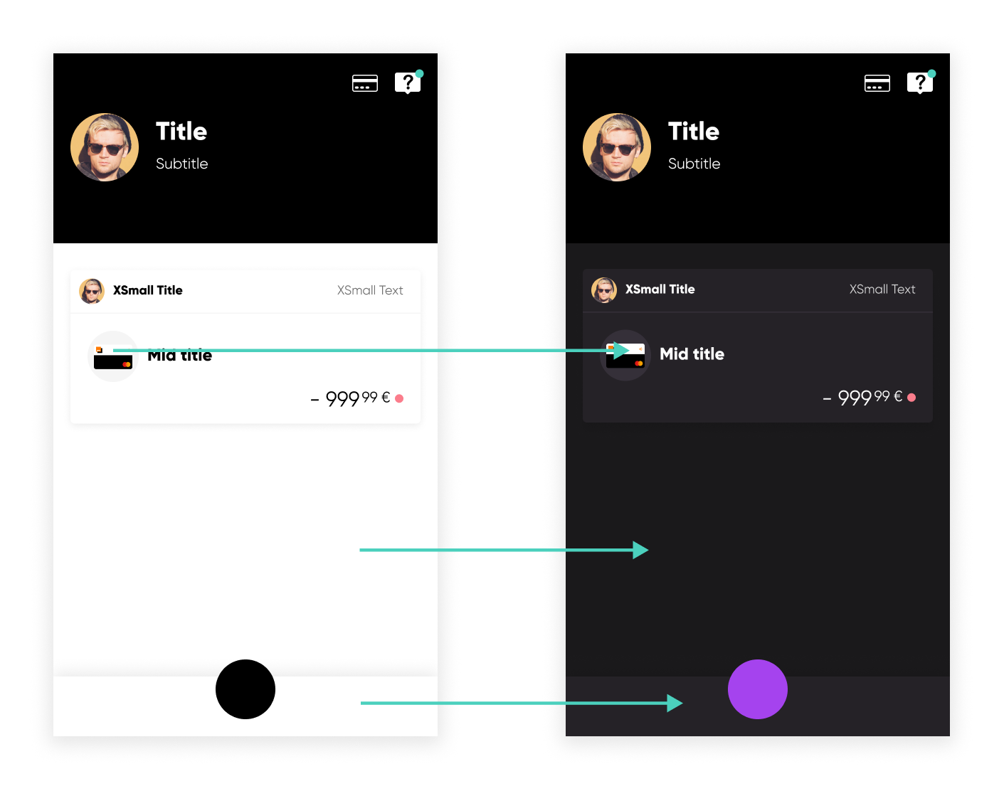
Our "White" were three different colors in dark mode. Image based on early dark mode concepts by Ana López
For this reason, we defined six different color categories:
- Full palette -> A visual catalog of all the different colors of the Orange Bank brand. Mainly used for illustrations.
- Background -> Contains colors used as backgrounds.
- Content -> Colors used for texts, links, buttons, and icons.
- Overlay -> Background colors for elements such as cards and sheets.
- Divider -> The different colors of dividers depending on the background.
- Chart -> For colors used in pie and bar charts across the app.
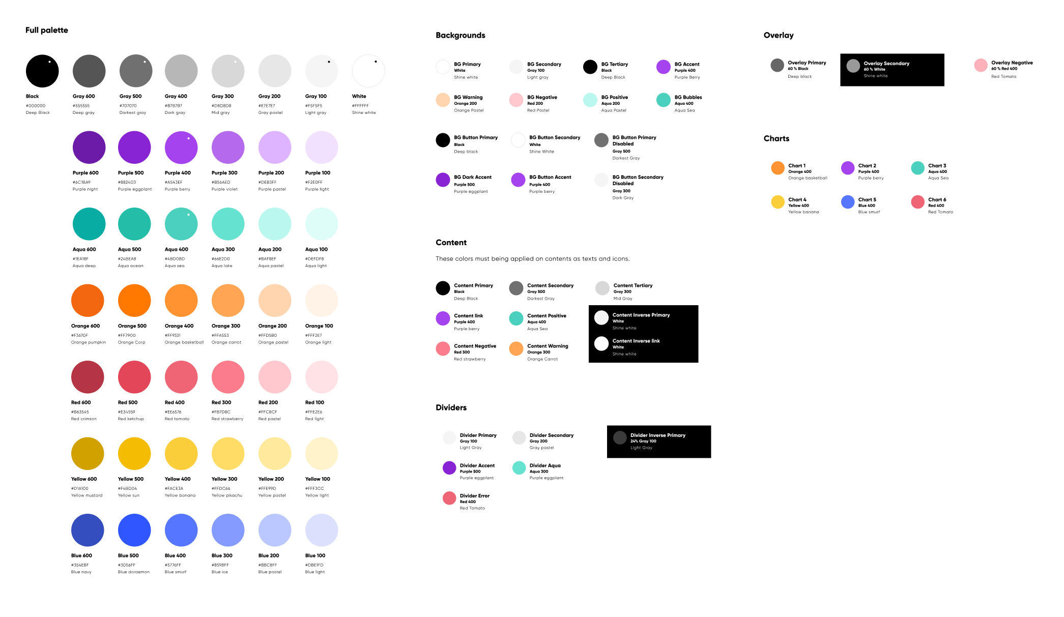
The new version of the color palette of Clementina (light mode)
Crafting the new library architecture
The main concern with the old component hierarchy was its inefficiency. Classifying components for their complexity (atoms, molecules, and so on) created a deep architecture in which the most-used ones were all in the same folder (as they were also the most complex). They were difficult to find, and it was difficult to include new components in the existing hierarchy. We needed a new architecture.
After reviewing and evaluating several design systems by different companies, we decided to create a shallower architecture based on several (most of the time) small categories with representative names. Visual Design Lead Irene Molina and I imported all the components to Figma and categorized them into groups.
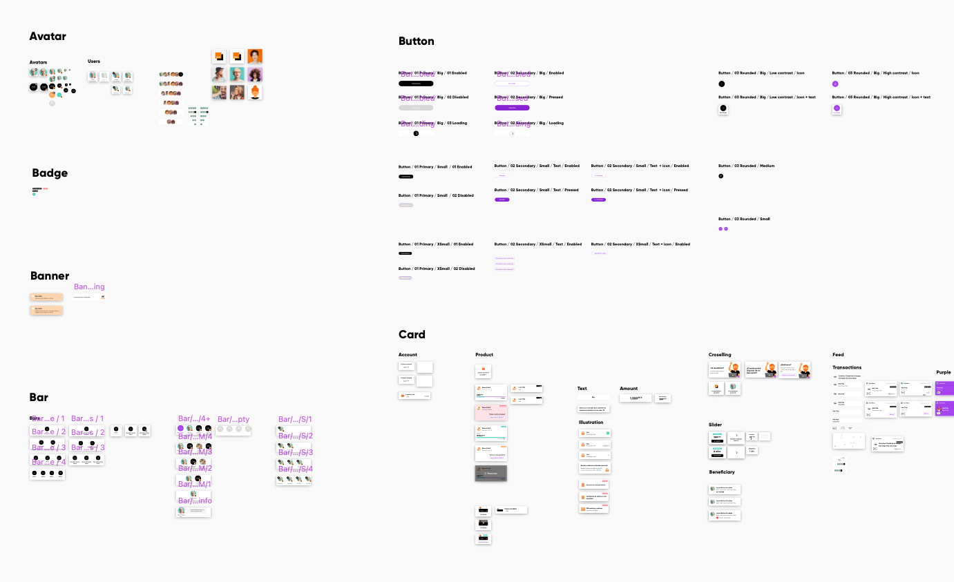
One of our early attempts at categorizing our components in Sketch
Sometimes, two or more groups would become a single category. For example: “Loader", “Progress bar" and “Stepper" eventually became “Progress”. Other times, the initial location for a component was not so intuitive for other members of the team. For that reason, we reviewed our progress with the design and development teams while creating this new architecture. After release, we also had to make some additional adjustments, but design systems are never stable!
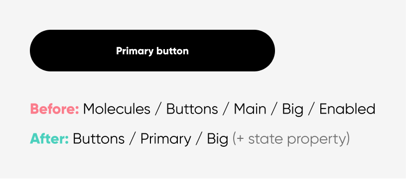
Pieces vs. Variants
One of the characteristics of Clementina in its Sketch version were component pieces. Pieces were interchangeable nested components without an identity. You could not use them on their own.
For instance, a card with a fixed height had pieces that allowed the card to have just a title (vertically centered) or a title and a subtitle. Therefore, there were two components; one with just a title and padding, and the other with the title and subtitle. They did not make sense outside their “mother” component because they were tailor-made for that specific use.
Irene and I spent days thinking about how to create the equivalent for the new design system without success. And right then, Figma released what we needed, although we still did not know. Component variants.
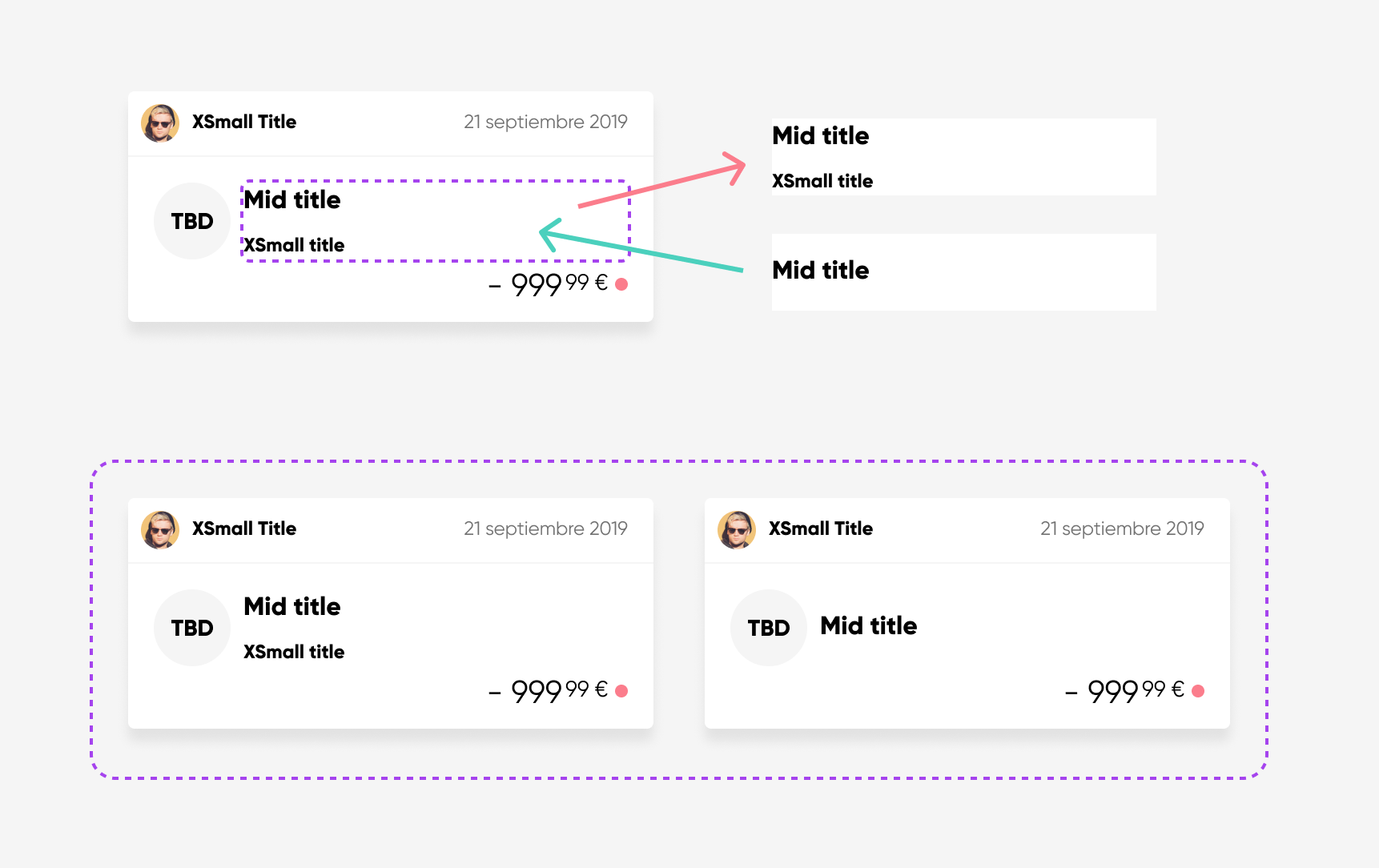
The different paradigm of Pieces (above) and Variants (below)
Variants completely changed how we saw variable components (or components with pieces). They allowed us to:
- Avoid depending on non-reusable elements and design how we wanted those components to work.
- Reduce our component count, simplifying the architecture.
- Use the same parameters in design and development components, making it easier for both teams to collaborate.
Pages and templates
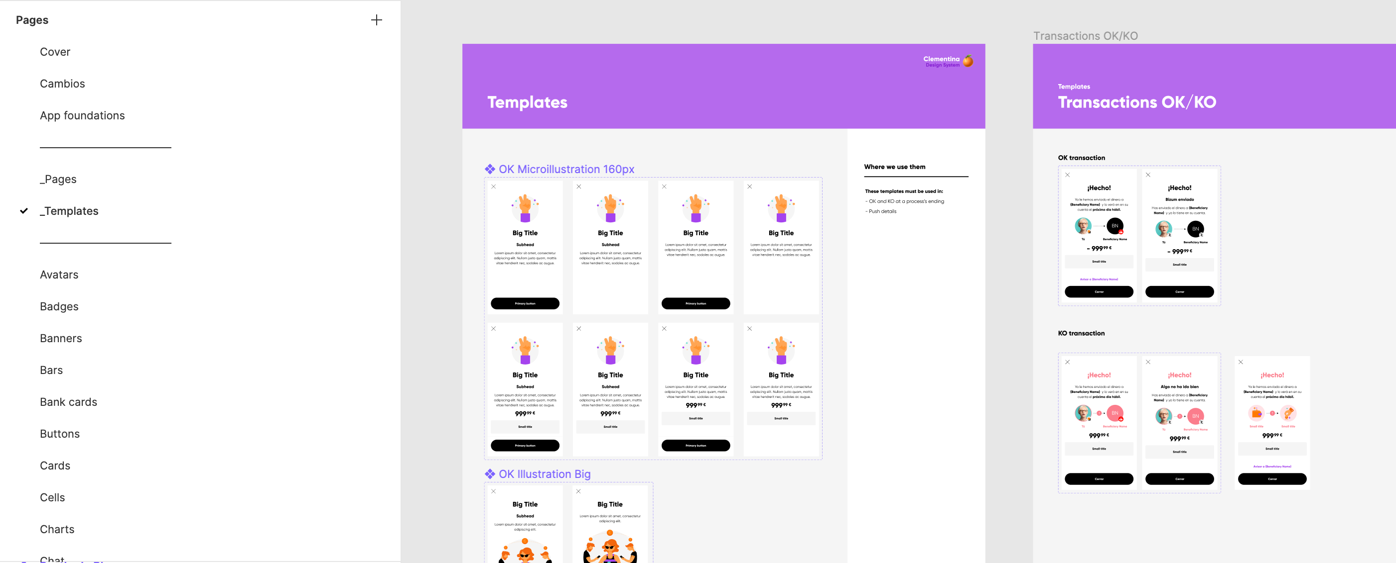
While we created components for the app, we realized several screens were almost identical. We had specific layouts for OK, KO, informative screens, promotions, and post-logins. But those screens did not exist as components in Clementina. Therefore, we created a Templates page dedicated to this purpose.
Furthermore, some screens like the login or the operation signature always had the same content and were often used to create prototypes to test with users. They could not be templates because they were immutable. They were Pages.
To prevent these categories from mixing with the rest of the components, and to make it easier for designers to access them, we decided to precede their names with an underscore (“_Pages” and “_Templates”). This way Figma locates both categories at the top of the list when alphabetically ordered.
Thinking outside the app
After finishing the app library, I continued migrating the onboarding and email libraries. But, as soon as I started migrating components, I realized the colors and illustrations I needed belonged to the app library. And it did not make sense to import the app library in those files to do something unrelated to the app. For this reason, I created the Foundations library.
Foundations is a library with all the components and styles that Orange Bank uses on its products (app, web, onboarding, emails, and marketing). Therefore, it contains the fundamental aspects of the visual identity of the brand:
- Colors
- Icons
- Microillustrations
- Illustrations
- Logos
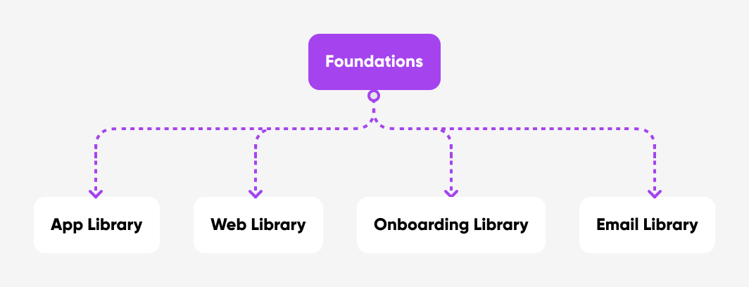
All component libraries use the basic elements from Foundations
If you are familiar with design systems, you will notice a notable absence: text styles. The reason for that is simple. We use a different letter type for the app (Gilroy) and the remainder of the products (Helvetica Neue). This peculiar characteristic of the Orange Bank brand forced us to dedicate a small Foundations page on typography within each of the specific component libraries.
Designing for developers
To make developers participate in the process, Irene and I scheduled weekly meetings with development chapter leads, showing them our progress and asking for their constant feedback.
Those meetings served to agree on names for components, as designers and developers called some of them differently.
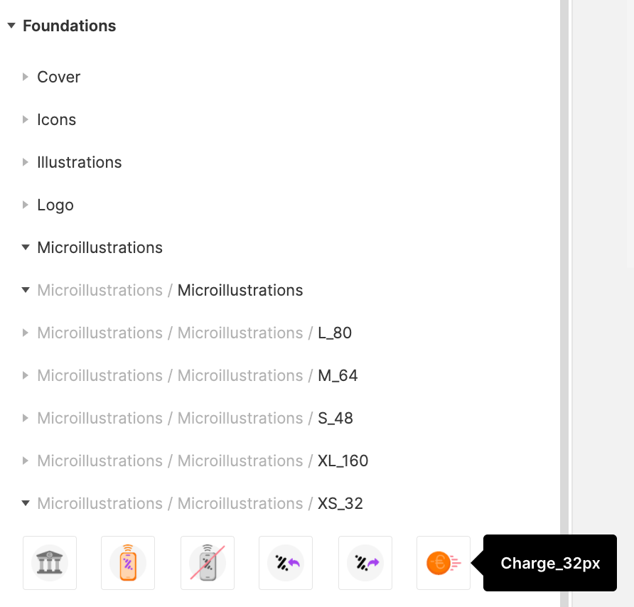
The other main topic of those meetings were assets (icons and illustrations) and how developers could download them from Figma. After they decided which tool they wanted to use (FigmaExport by RedMadRobot), we had to change how we organized assets so they could use it. We moved from having different frames for different asset sizes to having just one and including the folder as part of the component name.
This solution was less intuitive for designers, but the tool provided developers with a dynamic asset library that automatically updates every time a designer modifies an icon or illustration.
After trying this tool, developers also realized that the way we named the assets, their size was left out of the name in the downloaded file. We had to create redundancy by adding the illustration size at the end of its name although it was already in the name we saw in Figma.
Progressive migration
Once Clementina was fully redesigned in Figma, teams started to progressively migrate their files as well.
Two product designers participated as testers, using Clementina to design new features for their squads while slowly re-creating all their previously designed screens. This way, we tested the library architecture and discovered missing components that they needed. After they finished migrating their files, new designers entered this beta program until the whole company was working with this new version of Clementina.

The impact
Initial frictions but success in the midterm
The redesign of Clementina, the Design System Language of Orange Bank, had a positive reception by the design and development teams. However, there were issues as they were used to using Sketch and to designing with the old architecture. Visual Design Lead Irene Molina and I had to help our coworkers get used to the new tool and make the most of it.
At the time of writing (10 months after release), the redesign has been a success. It has changed the way the teams work at Orange Bank for the better:
- Migrating to Figma has reduced the budget spent on tool licenses since we have dropped five tools that we used before. However, we still maintain some licenses since the design team has not migrated every existing screen to Figma yet.
- Before release, designers spent a lot of time working on prototypes because they did not have a library that allowed them to design any screen of the app. Now, they devise new functionalities in a significantly minor amount of time, having more time to focus on testing the solutions with users.
- Onboarding time for new members of the design team has been reduced by half. Now it is easier for them to understand how to design new features for Orange Bank.
- Developers do not have to worry about downloading assets. They have a dynamic library of illustrations and icons in their app folder that automatically updates as assets get created, renamed, or deleted in Figma.
Thank you!
Here's more for you to read
Orange Bank - Optimizing the experienceProduct Design

Iberdrola DistribuciónUX Design
Merck - Con la EMUX Design
Get in touch
© 2026 | Rafael González · Senior Product Designer