Merck
Con la E.M. community

Date: December 2017 | Skills: UX Design | URL: conlaem.es
Merck's neurology department called our team to redesign its site for MS patients. They were looking to revamp it, with a more current appearance and useful features such as Stories (to give patients a chance to tell about their life with the condition), Events (to share and attend conferences...) and News (a blog with relevant and frequently updated content).
Their business goal was to build a relevant website for people suffering from this condition, so that Merck would become a benchmark company in the support and treatment of multiple sclerosis.
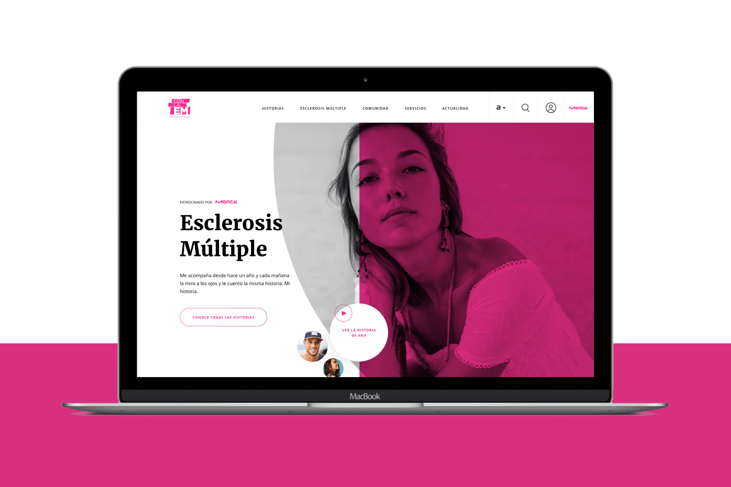
My Role
Based on the results of a patient research conducted by Merck and a benchmark performed internally by the Tribal team, my role consisted in conceptualizing the interface of the new site using Axure RP 8.
Methodology
Being several screens, we divided the task into 3 sprints of 3 weeks duration each during which I designed the wireframes of the site while the UI team worked on the visual part.
As we worked with a remote development team, we decided to make an equal division of time for the programming tasks. That way, development work was done a sprint behind the UX/UI design.
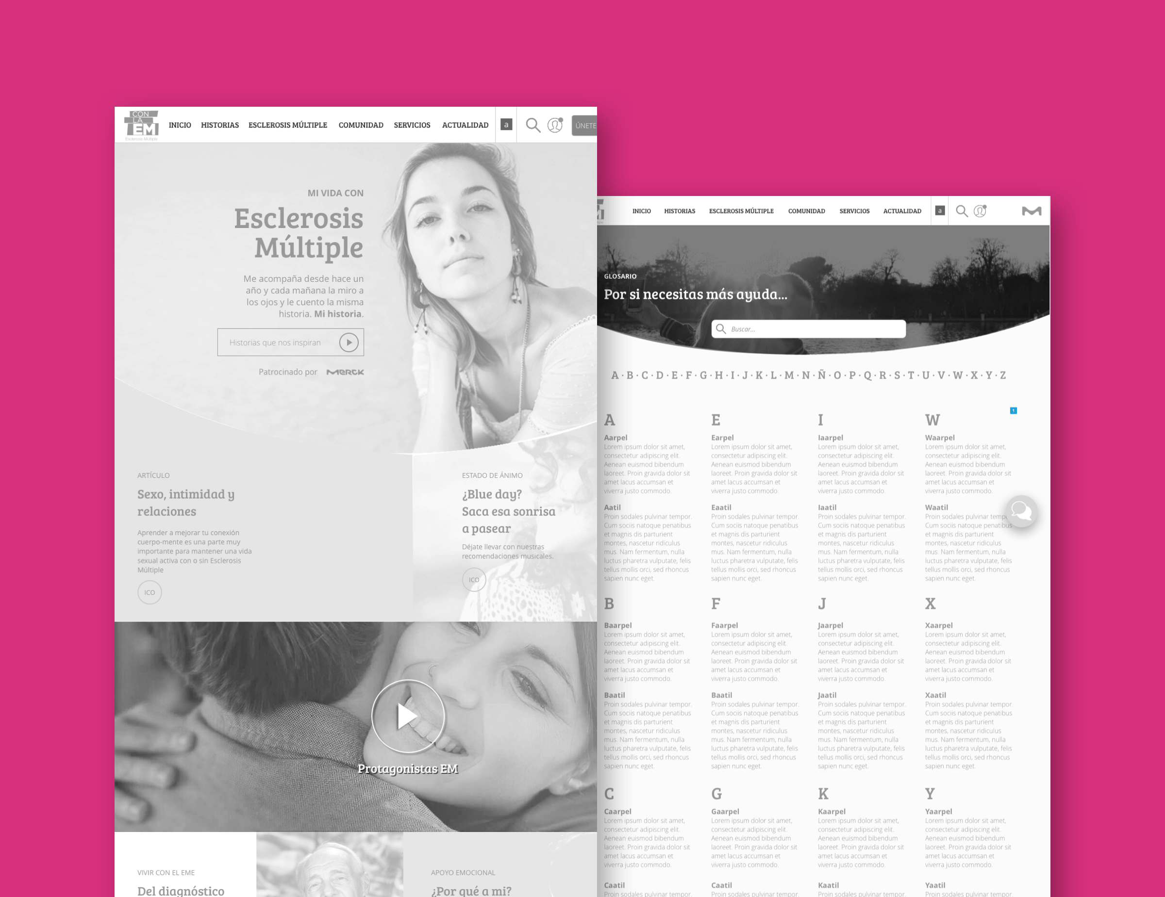
Wireframing (Sprint #1)
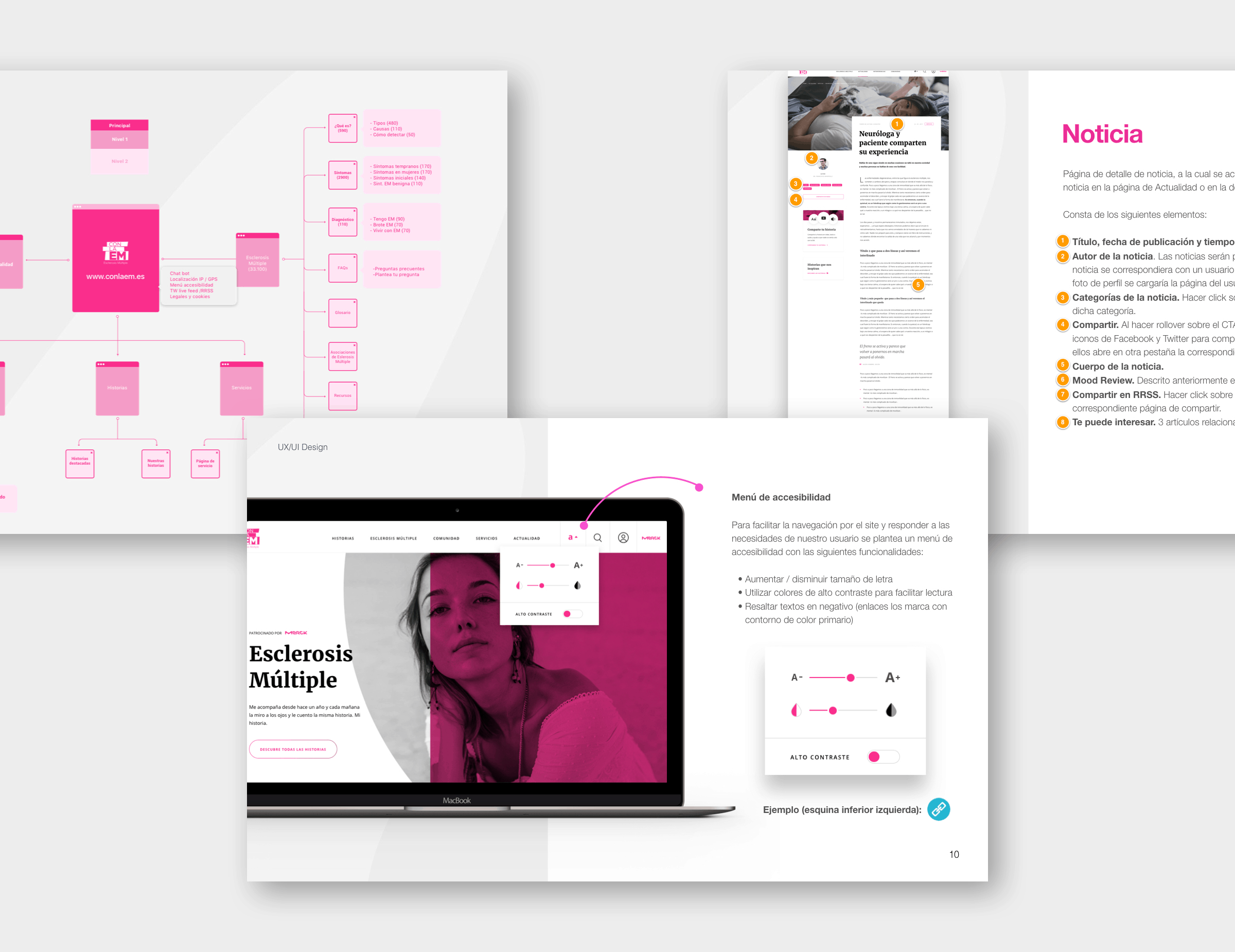
The first design sprint consisted in conceptualizing a small version of the site, which only included the home page and the essential information pages.
The main hurdle at this stage was to collaborate with Merck to define the information architecture based on the results of their research and their business goals.
Another highlight was the design of the glossary screen. I worked closelly with the SEO team, who recommended creating a unique page for each term's definition in order to improve organic positioning (each definition belonged to a different URL).
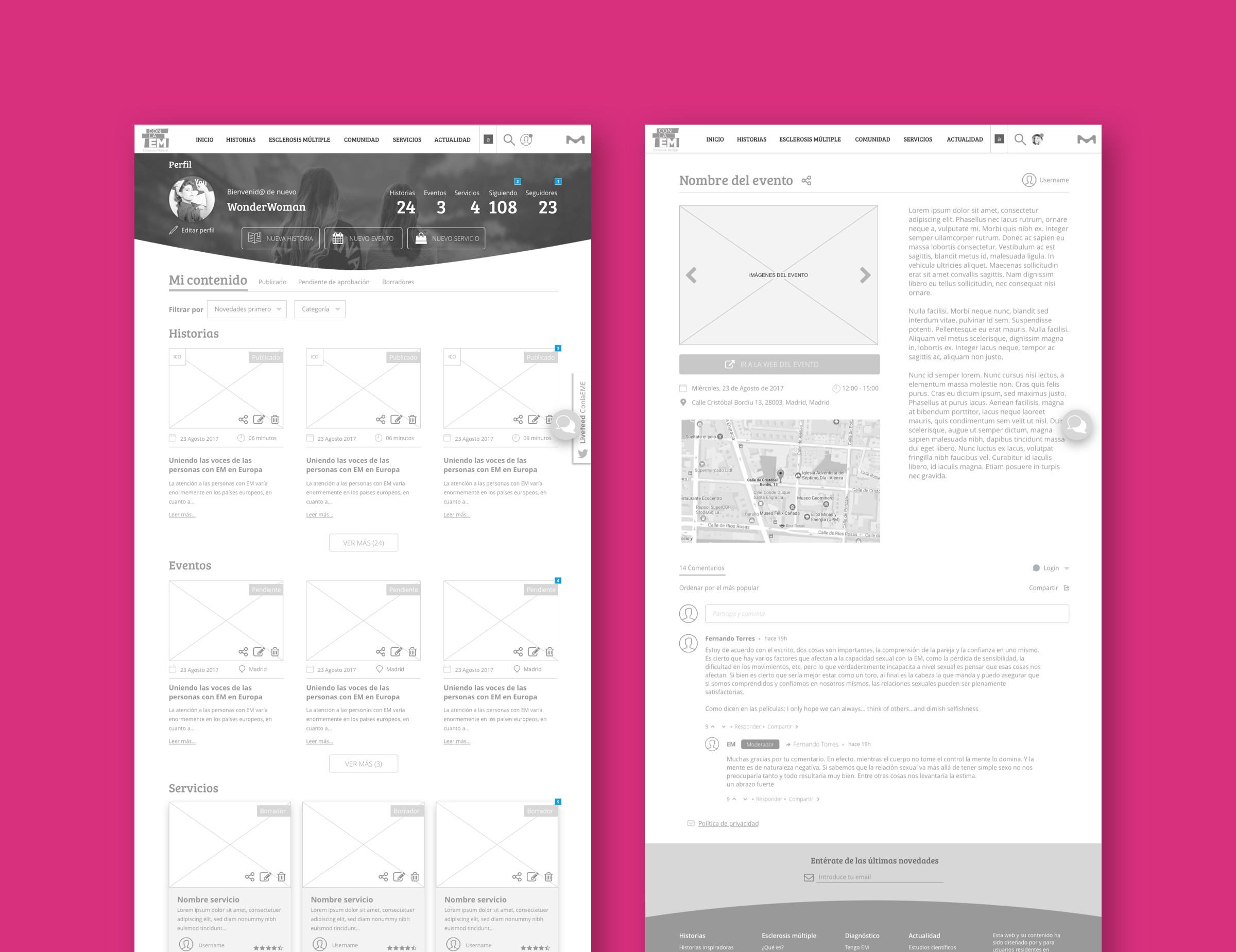
Wireframing (Sprint #2)
During the second stage, we enabled registration on the site. I also designed the screens needed to allow viewing and creating events, reading news and viewing the activity of other users.
This time the most complex task was to design the user profile with its followers and following lists, the options to edit personal data... And deciding which information should be accessible for logged used and which not, to encourage registrations.
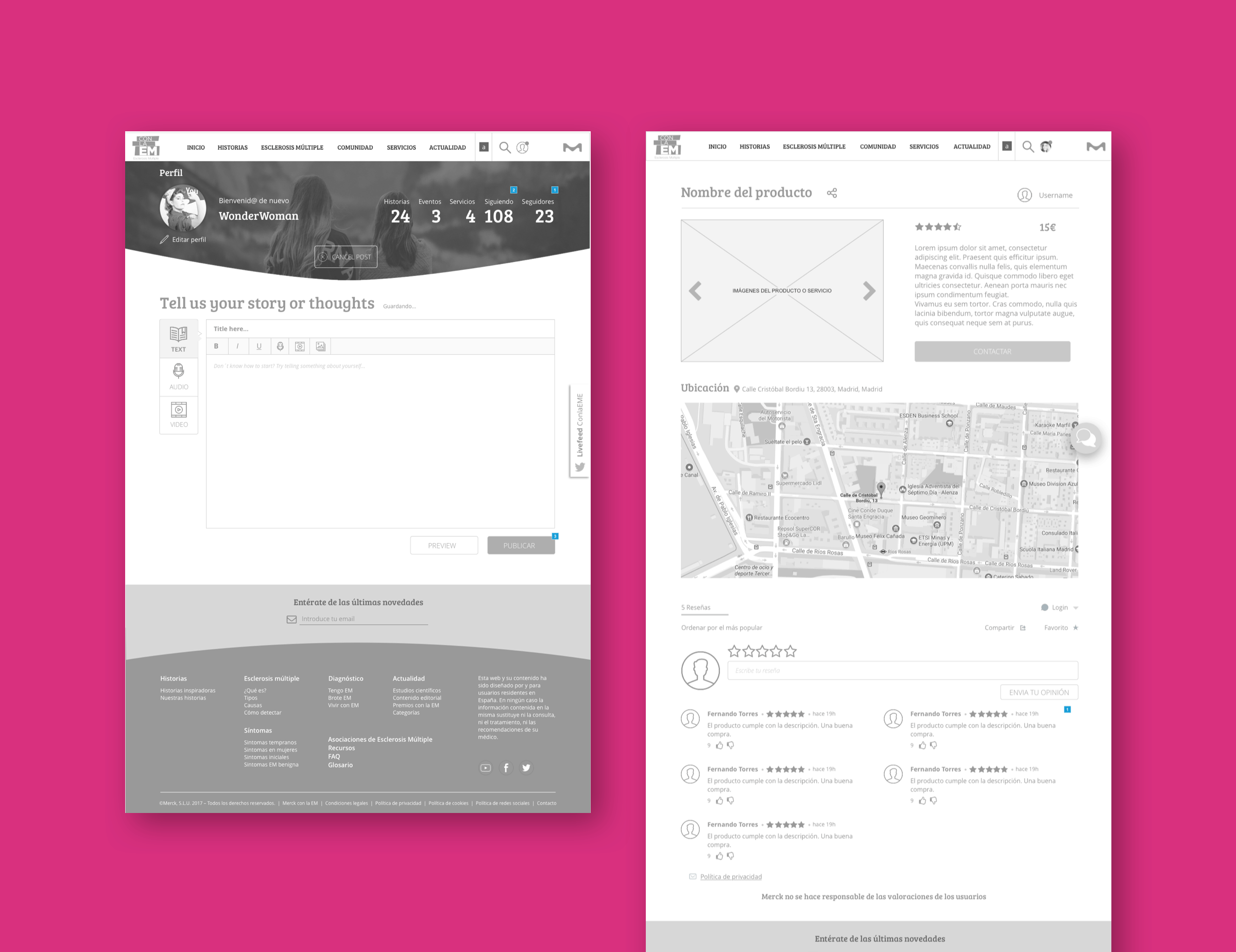
Wireframing (Sprint #3)
Finally, during the third design sprint, I added the screens for stories and services. The content of these screens depends solely on the users since they are the ones who create it.
After finishing the conceptualization of the website, it was tested with three kinds of users: patients with multiple sclerosis, medical staff, and caregivers. With the insights obtained during these tests, we executed the suitable adjustments to correct the incidents detected. For example, the Actuality section was redesigned since most users found it difficult to visually differentiate what was a news item and what was an event.
Specifications document
Along with the whole process of wireframing, I wrote a functional specifications document for each sprint with the necessary descriptions for front-end (describing screens and their behavior) and back-end (data model) developers.
Thank you!
Here's more for you to read
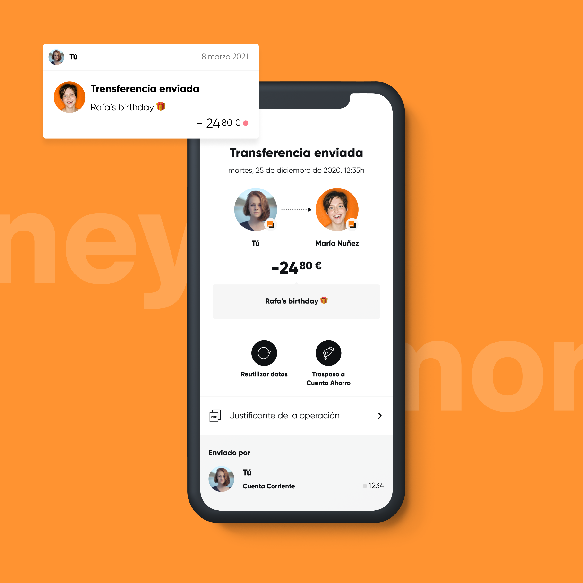
Orange Bank - Optimizing the experienceProduct Design
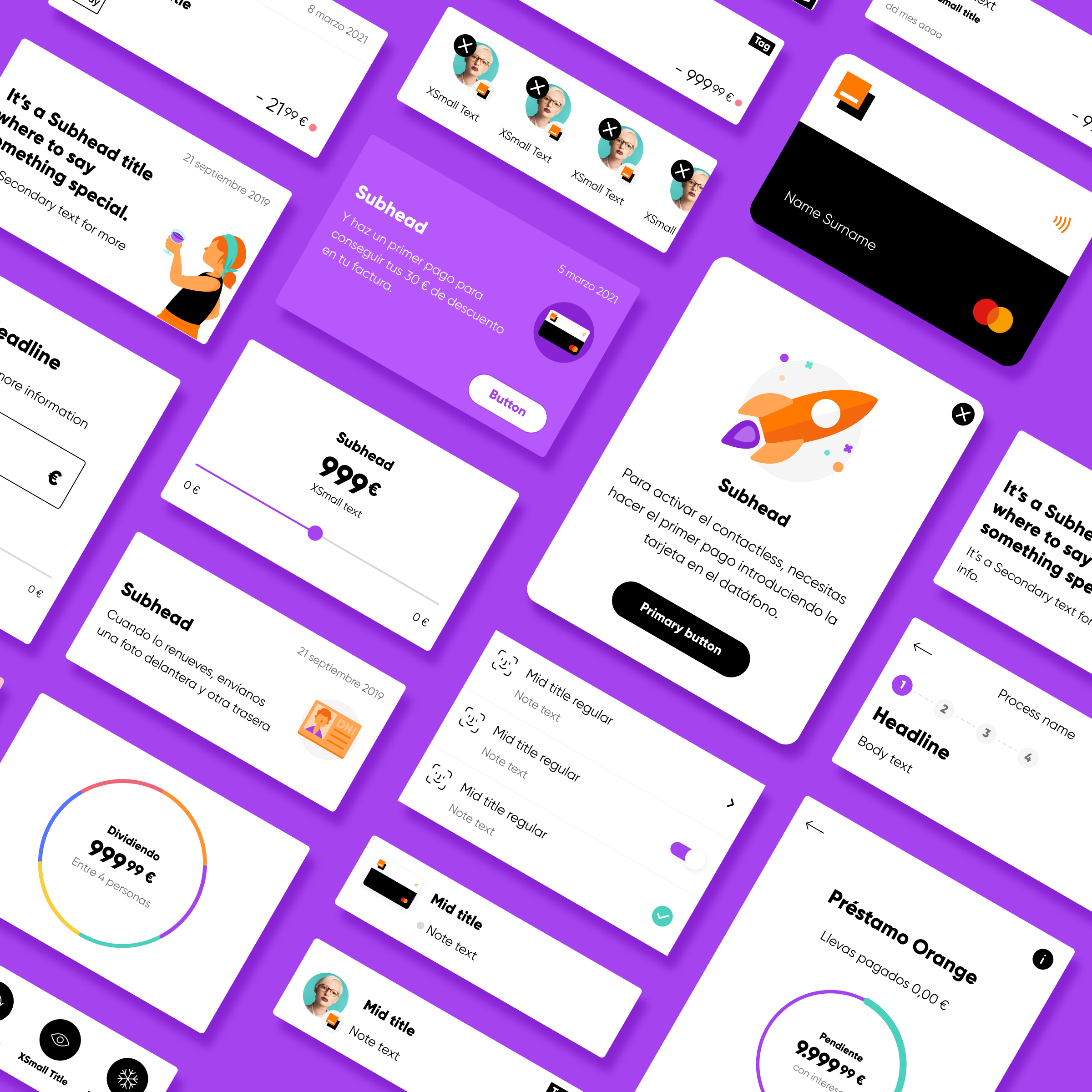
Orange Bank - Redesigning Clementina DSLDesign System

Iberdrola DistribuciónUX Design
Get in touch
© 2026 | Rafael González · Senior Product Designer