Orange Bank
Optimizing the experience

Using data to polish the Orange Bank experience
In 2018, Orange, one of the largest European phone operators, created a new company to provide financial services in Spain: Orange Bank. Its mission was to reduce the phone company’s churn by providing Orange clients a mobile banking experience with a short but strong product portfolio.
Orange Bank launched in November 2019 and, despite having tested the app with users several times during the design process, the data of real users uncovered some issues to address.
My role
Formulate hypotheses based on both quantitative and qualitative data from users provided by the Product Owner of the squad.
Prototype, design, and sometimes test solutions for the problems.
Disclaimer: To comply with my non-disclosure agreement, I have omitted and obfuscated confidential information in this case study. All information in this case study is my own and does not necessarily reflect the views of Orange Bank.
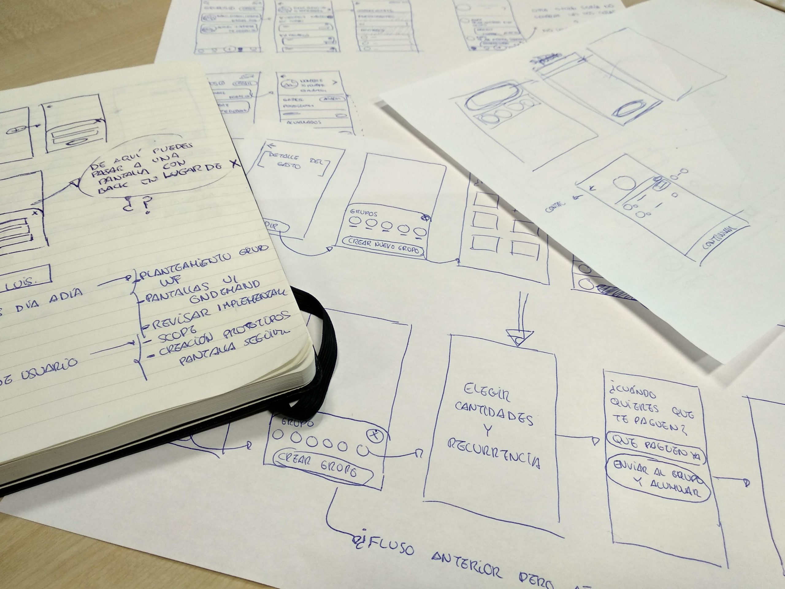
Case 1: Reducing failed login attempts
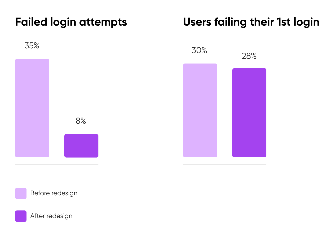
Two months after launching the app of Orange Bank, data showed that 35% of login attempts were unsuccessful due to an incorrect email or password. Product Owner Borja Herrero and Head of Design Daniel González thought there was an issue producing this unusual behavior. As the Product Designer of the squad responsible for this process, I was in charge of solving it.
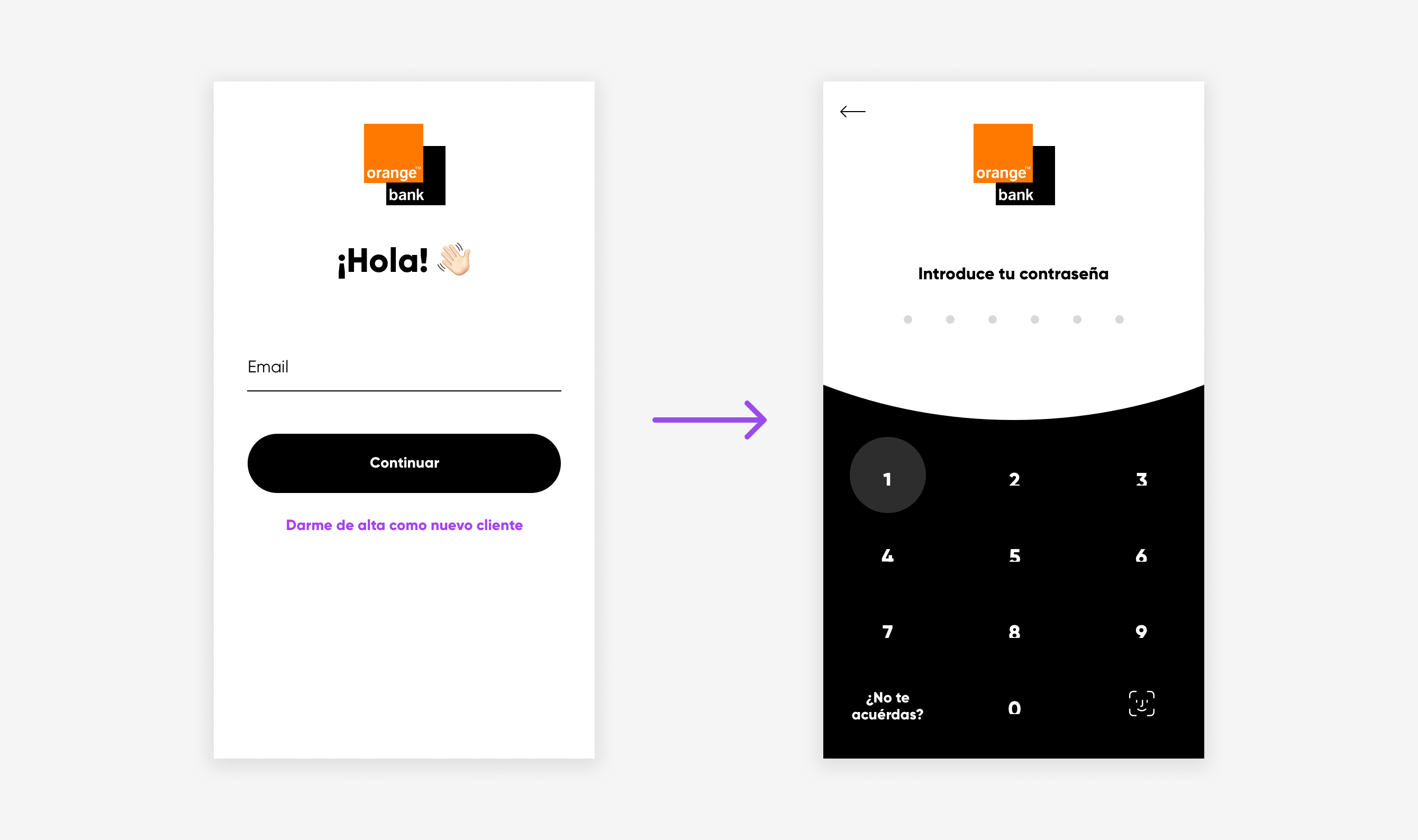
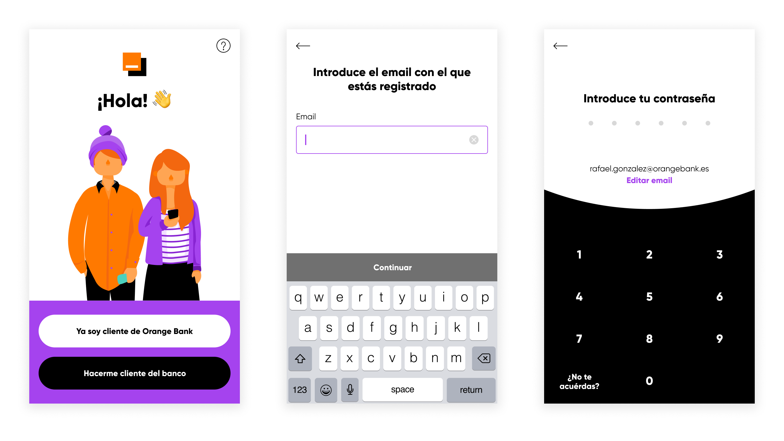
The login process consisted of two different screens (email and password).
Hypothesis
Parting from that data, UX Researcher María Núñez included the login in one of the following user tests scheduled for the new features.
The login process consisted of two different screens (email and password). We found out users believed they had misspelled their password instead of the email since the password screen informed them of the mistake. Thus, they tried to log in multiple times without realizing the actual problem.
I also thought that the text in the login and signup calls to action might make users accidentally try to log in with their Orange customer data instead of creating a bank account first since phone and bank accounts are independent.
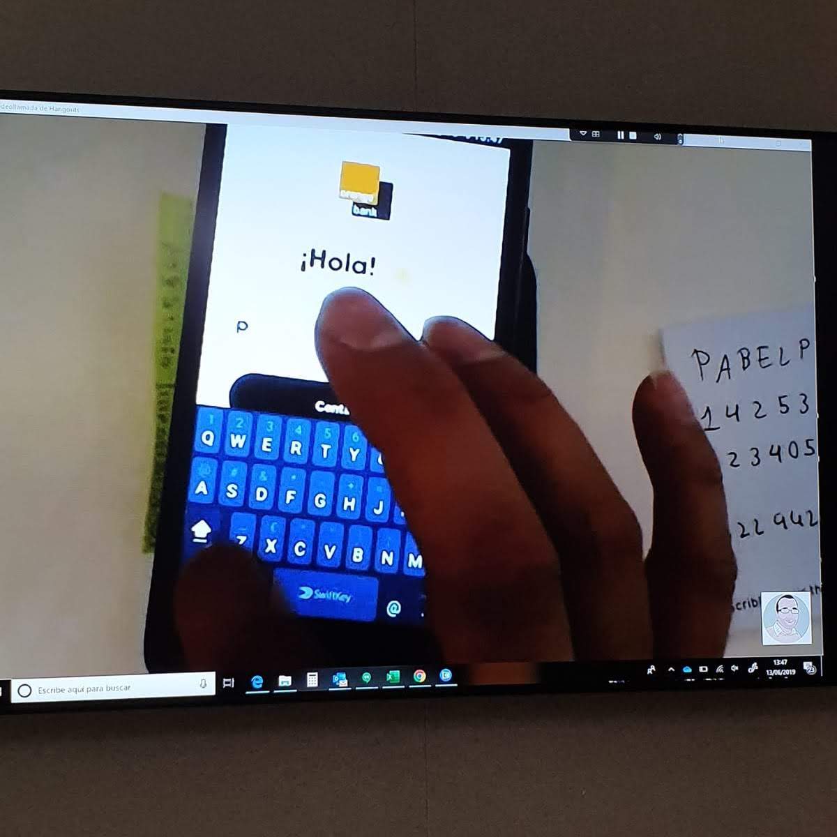
We tested the login process with users to understand the problem.
Prototyping a solution
To solve both issues, I redesigned the login process by including a welcome screen where the client chooses to log in or create their bank account and added the email, with an option to edit it, on the password screen. That way, I thought I would resolve both of the problems detected.
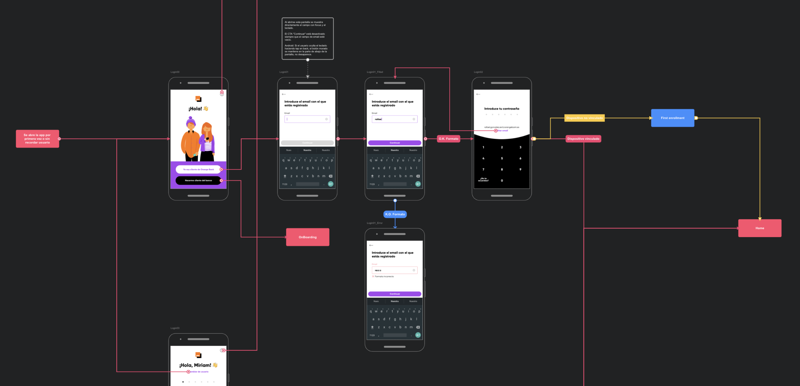
Flow map documenting the login redesign, including the welcome screen and the option to edit the email on the password screen.
Results after two months
The redesign reduced failed logins per user by half, but around 28% of clients still had problems with their first login. It was a start, but the process was still far from being perfect.
With those results in mind, I decided to change the way the login error was displayed since the password screen informed users of the mistake by making the password input vibrate. Unfortunately, we could not tell the user whether the email or password was incorrect for security reasons. Therefore, I designed a toast notification informing that the error was in one of them to push users to check if it was the first rather than the latter.
Impact and conclusions
That last change reduced failed login attempts to less than 3%. However, the percentage of clients missing their first login was still high. Given all the work to make the login flow smoother, I think the issue is no longer part of the login process but rather a different problem related to the password itself.
- The password for the account is not the usual password. It consists of six numbers instead of the usual alphanumeric and non-length-restricted password that other services use.
- The client sets the password on the web while they open the account, but they do not use it until they download the app. In this time frame, clients may forget their password and err their first login as a consequence. The password restrictions mentioned above may aggravate this issue.
Case 2: The problem with PEPs (Politically Exposed Person)
In the registration process of Orange Bank, we ask future clients if they have a political charge or if they are related to someone who has. The Fraud & AML (Anti Money Laundering) team uses this information since those clients are more likely to be involved in fraudulent activities. If a client declares they are a PEP or related to one, the Fraud & AML team studies them to discover if they are and the actual political activity at issue.
However, 99% of clients that declared they had political responsibilities didn’t have any. This problem caused the Fraud & AML team to spend more time than necessary investigating those clients.
On the other hand, the number of clients declaring this was not enough to show up on user tests, so all the clues that we had to solve this issue came from the data itself.
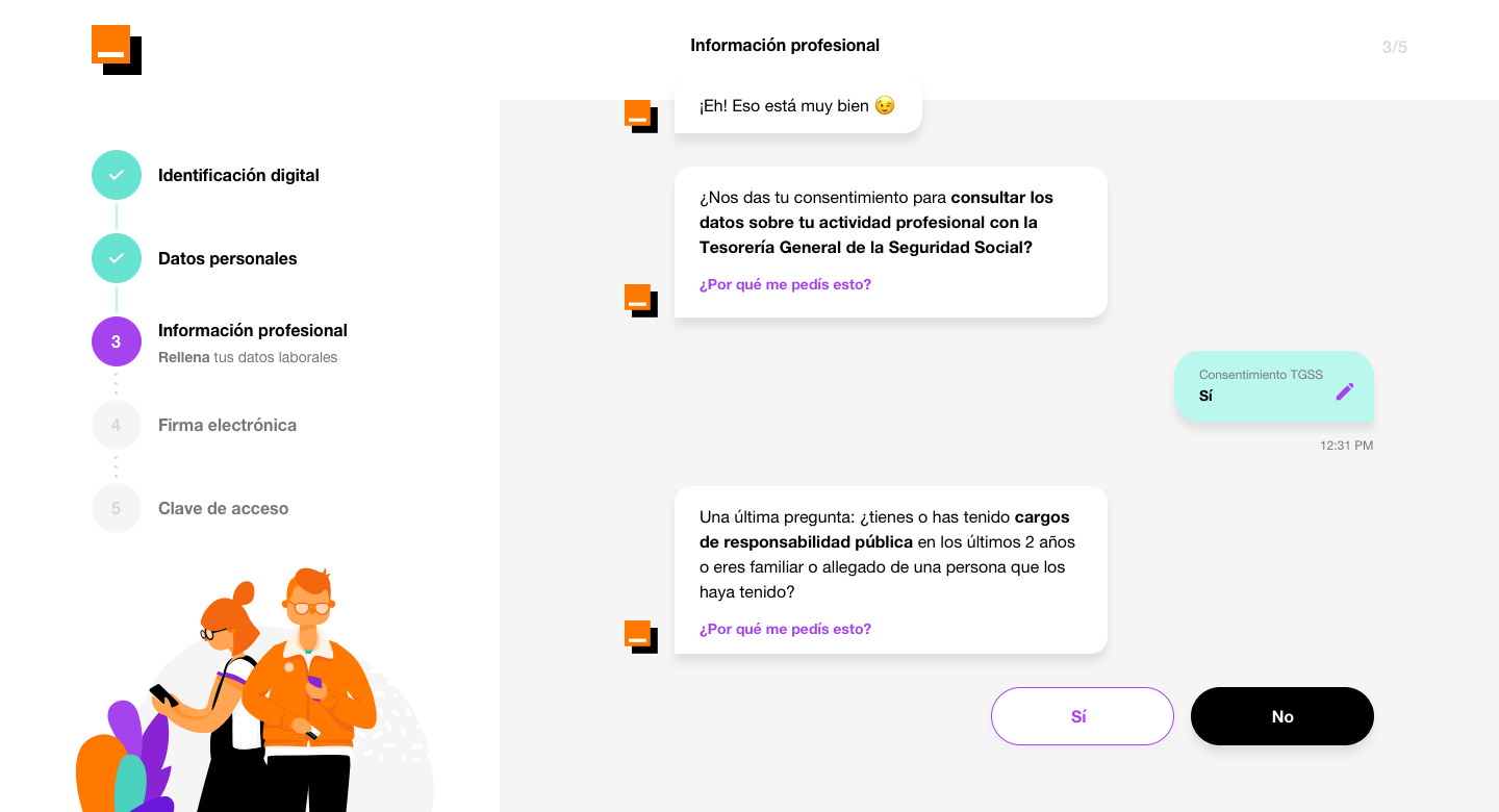
The problematic question is “Have you had any public responsibility position in the last two years, or are you related to someone who has?”.
Hypothesis
The question (“Have you had any public responsibility position in the last two years or are you related to someone who has?”) might be confusing, making users think that if they are in a customer-facing role, they had to respond with a yes. Expressing the same idea with other words could help people understand the question better and give an accurate answer.
Designing a solution
I worked with UX Writer Carlos Bernal to write a better phrasing for the question. After seeing how other banks handled the issue (for example, BBVA included a dropdown to select the actual public position), I decided to keep things simple and include a confirmation modal for users who did not stop to pay attention to the question in the first place. The text on that modal explicitly said “high-rank public position” to avoid confusion with customer-facing roles.
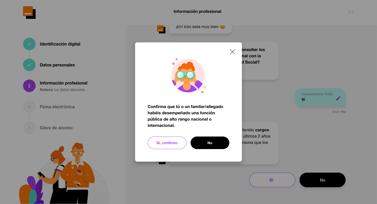
The new confirmation modal tried to stop users who said yes and give a better explanation of the question.
Impact
Three months after development, the problem persisted. The changes did not reduce the number of customers declaring they had public responsibility positions. Shortly after that, I moved to another team and could not propose another solution.
Conclusions
After I left the squad, fellow Product Designer Guillermo Torres designed a new confirmation screen with two dropdown menus to select the public position and who was in it (the user, a relative, or a friend). That change made users move to the previous screen and deny they were PEPs when they realized the actual positions involved.
Sometimes, keeping things as simple as possible for the user may have undesired consequences. In this case, making the user answer with a yes or no caused many of them to respond erroneously with the consistent waste of time for the Fraud & AML Team.
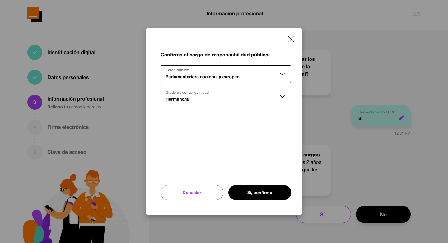
The final solution, by Guillermo Torres was a more complex and time consuming interaction. But it worked.
Case 3: Duplicate customer support tickets
One month after Orange Bank was released, the Customer Care team reached Head of Design Daniel González because of a 15% duplicate customer support tickets (chats). The customer care team was split into different offices, making it hard to detect duplicated issues to avoid having two people taking care of the same problem.
Hypothesis
The design of the help screen had a big module dedicated to creating a new chat. I assumed most people with a ticket already opened, opened a new one instead of accessing their chat history to resume their conversation because of that module.
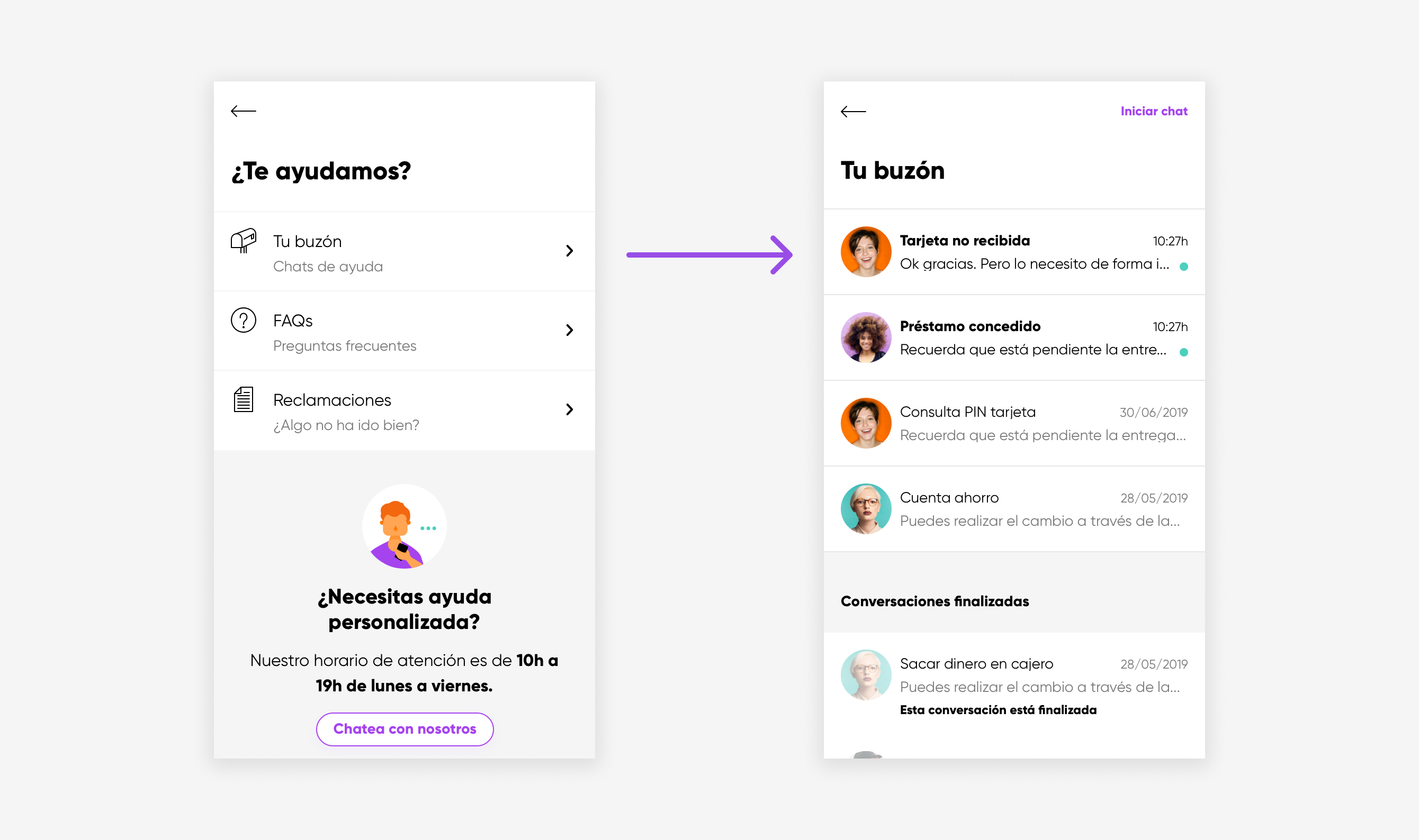
I thought the option to create a new chat (on the bottom of the first screen) caught the client’s attention more than the “Inbox” navigation at the top.
Prototyping and testing a solution
With that initial hypothesis in mind, I redesigned the help section making content easier to access and that module dynamic. If a client does not have any ticket created, it creates a new one. If they have one, it becomes an access to their chat history. After finishing the designs and reviewing them with both Heads of Design and Customer Care, I prepared a prototype to test the solution with users.
Users seemed to understand how to create their first ticket and resume previous conversations successfully. However, the link “Start chat” still confused some users. They did not comprehend whether it would create a new chat or resume their last one. With that finding in mind, I changed the text link from “Start chat” to “New chat” and handed off the designs to the development team.
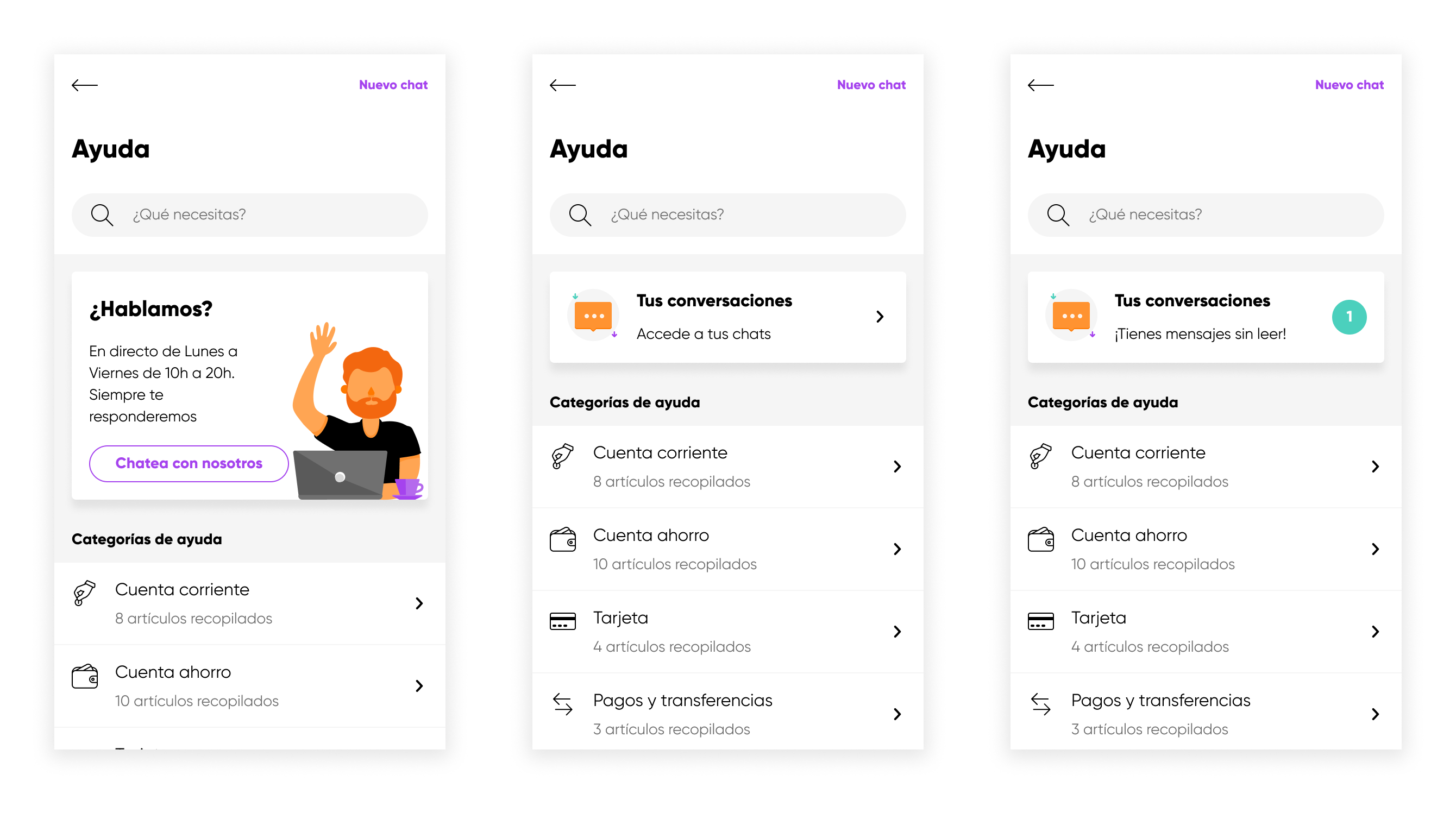
For the redesign, I included a dynamic module whose content depended on whether the user had never created a ticket, whether they had but had no new messages, and if they did.
Impact
One month after release, the redesign of a help screen was a success. Duplicate tickets were reduced to less than 0,5%, saving time for the Customer Care team.
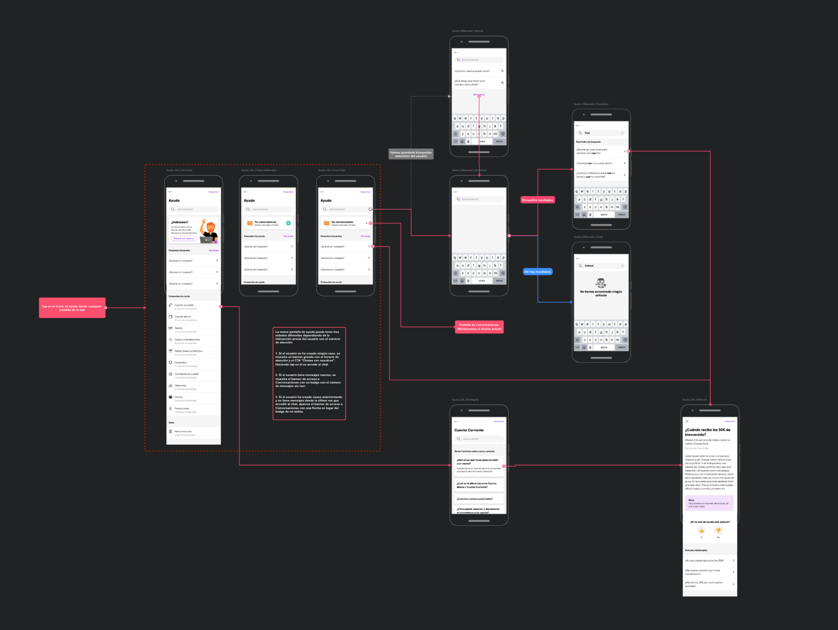
Flow map of the Help section redesign with functional specifications for developers.
Thank you!
Here's more for you to read
Orange Bank - Redesigning Clementina DSLDesign System

Iberdrola DistribuciónUX Design
Merck - Con la EMUX Design
Get in touch
© 2026 | Rafael González · Senior Product Designer